What counts as a cluster in a supplier concentration map?
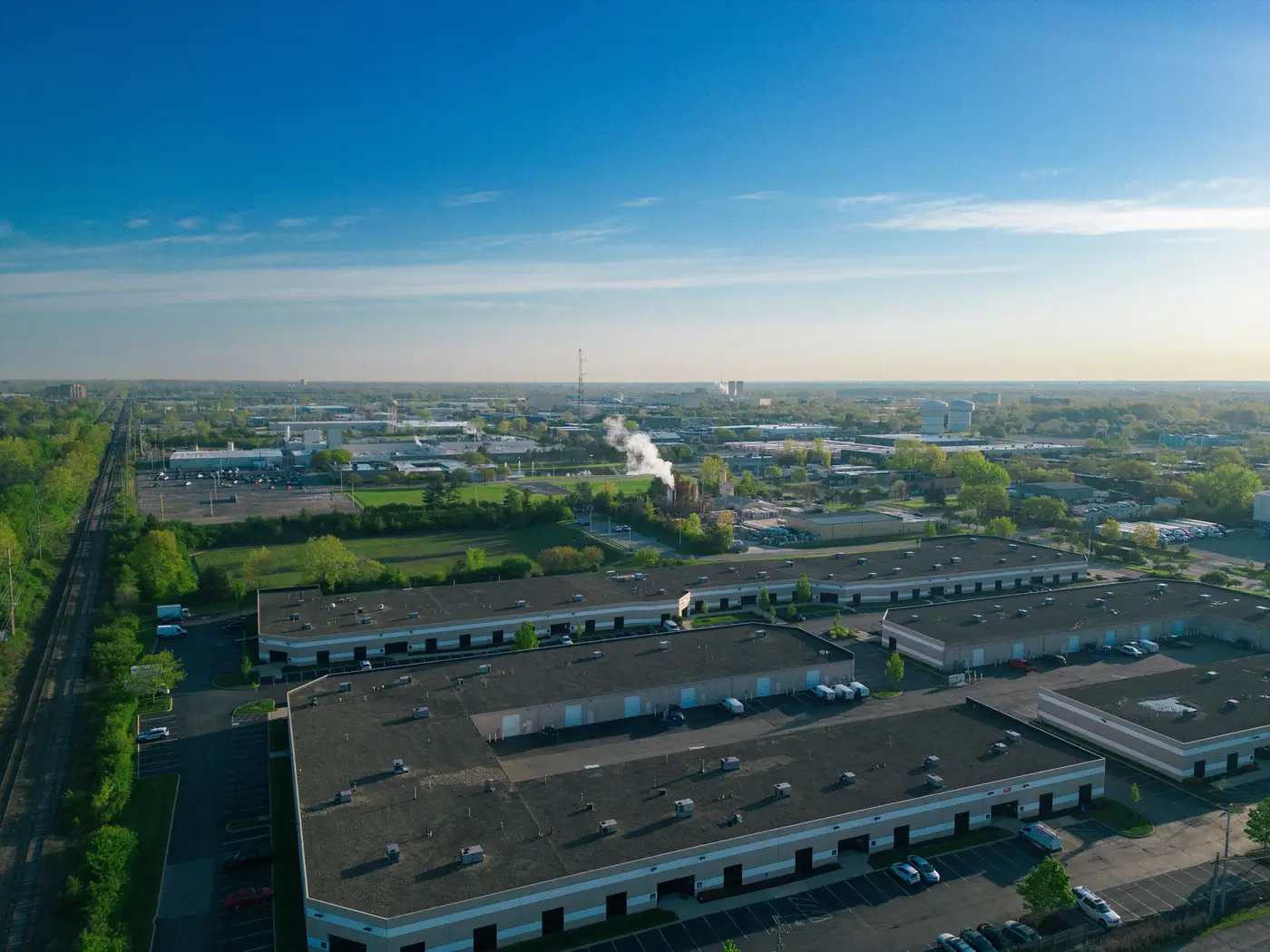
Your vendor list has forty line items for a category. Forty names, forty addresses, forty purchase orders. It looks diversified. Then someone draws those forty addresses on a map and twenty-six of them sit inside the same industrial park outside the same mid-size city. The spreadsheet never showed you that, because a spreadsheet doesn't do geography. It does rows.
That's the gap a concentration map is built to close. But "cluster" gets used loosely, and if you're the one presenting the findings to a risk committee, you need to be precise about what the term means before someone asks.
A cluster is a shared exposure, not a shared postcode
Two suppliers in the same city aren't automatically a cluster. A city can span fifty kilometers and three different river basins. What makes a group of sites count as a cluster is that a single event, a flood, a port closure, a substation outage, a regional lockdown, would hit all of them on the same day for the same reason.
That's why the unit on the map isn't "country" or even "city." It's the industrial park, the flood plain, the port catchment, the grid zone. A cluster forms when supplier footprints overlap one of those physical boundaries closely enough that the same disruption takes out every site inside it at once. Three suppliers scattered across a metro area aren't a cluster. Three suppliers inside the perimeter of one industrial park are, even if they compete with each other and invoice you separately.
Proximity on the map is measured against terrain and infrastructure: the flood plain boundary, the industrial park fence line, the single substation feeding a district. That surprises most category managers the first time they see one. The map doesn't care that Supplier A and Supplier B are rivals who'd never share a boardroom. It cares that their two buildings sit on the same drainage basin.
Legal separation doesn't mean physical separation
Procurement systems track legal entities. A concentration map tracks ground. Those two views disagree more often than people expect. A tier-1 supplier and its tier-2 subcontractor can be listed as unrelated vendors in your ERP while operating out of adjacent lots behind the same perimeter fence. On paper, you have two suppliers. On the ground, you have one site with two invoices coming out of it.
Manual cross-referencing misses this exact blind spot. Someone pulls up the vendor list, checks each address against a map one at a time, and still doesn't catch it, because the two addresses look like different streets in the same district. Nobody traces the industrial park boundary by hand across forty rows before the next sourcing event is due.
What the ranked list actually tells you
Once the clusters are identified, the output is a ranked list: which cluster holds the largest share of category spend, how many of your listed suppliers sit inside its boundary, and where that boundary sits relative to the thing that could knock it out (the river, the port, the single access road). Ranking matters because not every cluster is worth a mitigation conversation. A cluster holding three percent of spend is a note in the file. A cluster holding forty percent is a line item on next quarter's risk register.
That ranked list turns the map into something you act on. You read down a list that already did the sorting, from the cluster that would hurt the most if it went dark to the one that barely registers.
If your category review has been running on a vendor spreadsheet and a map tab open in another window, a concentration map built from your category spend and your suppliers' physical geography does that cross-referencing for you once a year, before the industrial park nobody had noticed becomes the one everyone's asking about. Take a look at what Sourcing Concentration turns up for your next category review.